Okapa
ART DIRECTION FOR OKAPA CAMPAIGN
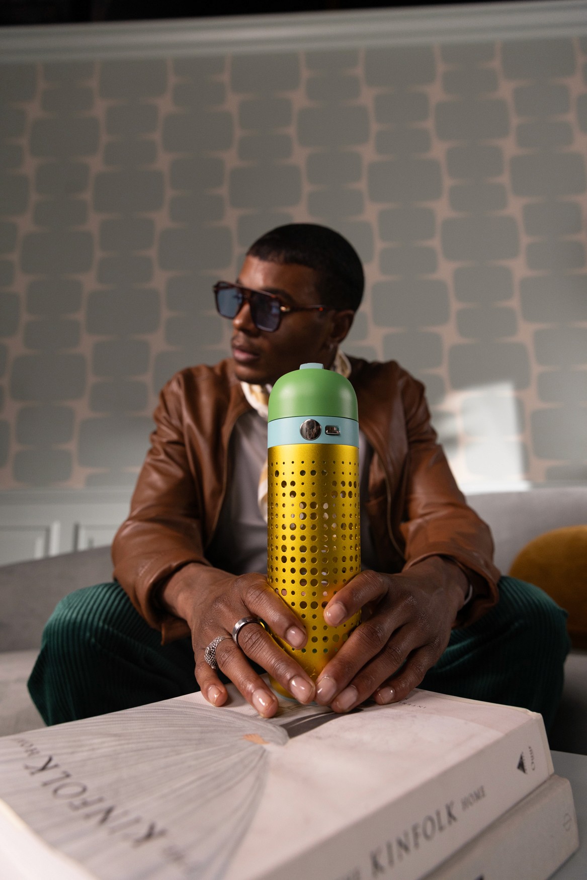
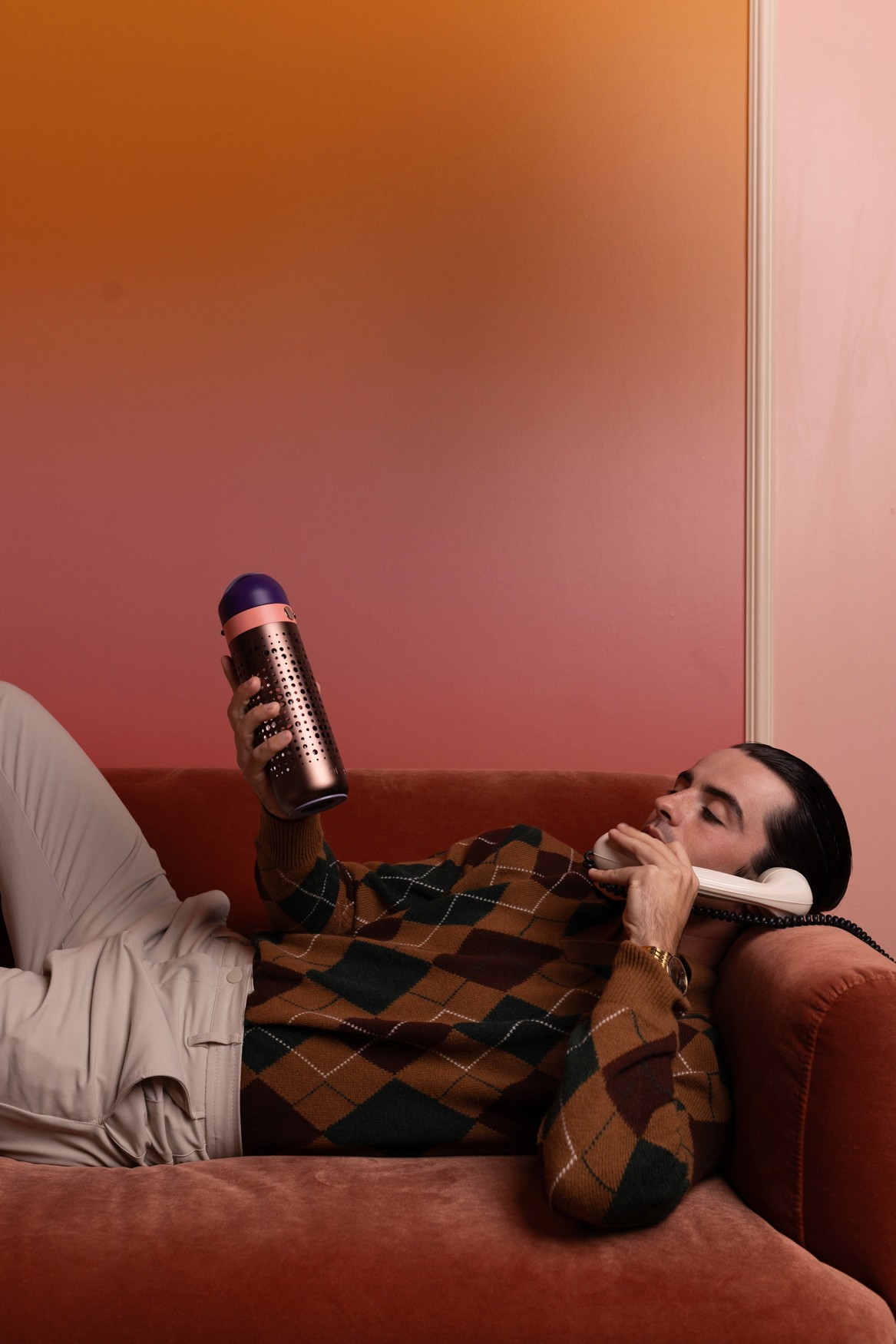
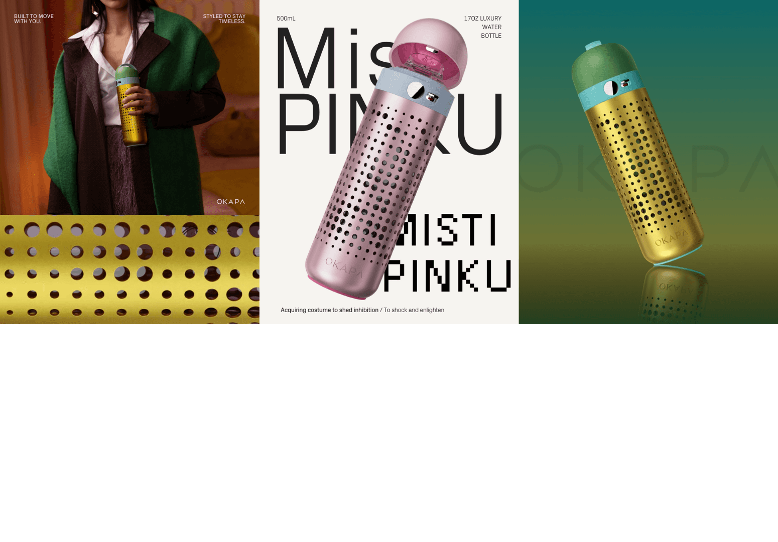
Concept centered around the brand’s distinctive color palettes. Locations, styling, and wardrobe were carefully curated to complement the product, resulting in a cohesive and fashion-forward campaign that elevates the product through a luxury visual narrative.
Client
Okapa
Concept & Direction
This project was developed for OKAPA, working as Art Director alongside a creative team, the direction was to position the product within a fashion-forward and editorial context, creating a refined narrative that aligns with a more premium and aspirational brand image. The strategy focused on translating the product’s distinct color palettes into a cohesive visual language, where each element, from location to styling, was intentionally selected to enhance and complement the products.
Execution & Outcome
The vision was executed through combining photography, video, graphics and motion concepts. Together with Creative Director Jacob Fisher, I led the visual direction of the scenes on set. I also developed the graphic elements as well as the concepts for animation, ensuring consistency across all outputs. Collaboration across creative roles, including photography, styling, lighting, and production, was key to achieving a unified result.
The outcome is a cohesive set of assets designed for use across social media, web, and advertising platforms. The work establishes a stronger and more elevated brand identity, enhancing the product’s perceived value through a clear, luxury-driven visual direction.