Snackables
BRANDING & WEBDESIGN FOR SNACKABLES
A bold and playful brand identity developed to capture attention within a fast-moving digital landscape. Through vibrant colors, bold typography, and a distinctive illustrative logo, the visual direction creates an engaging and memorable presence that reflects the agency’s dynamic approach to content creation.
Client
Snackables
Concept & Direction
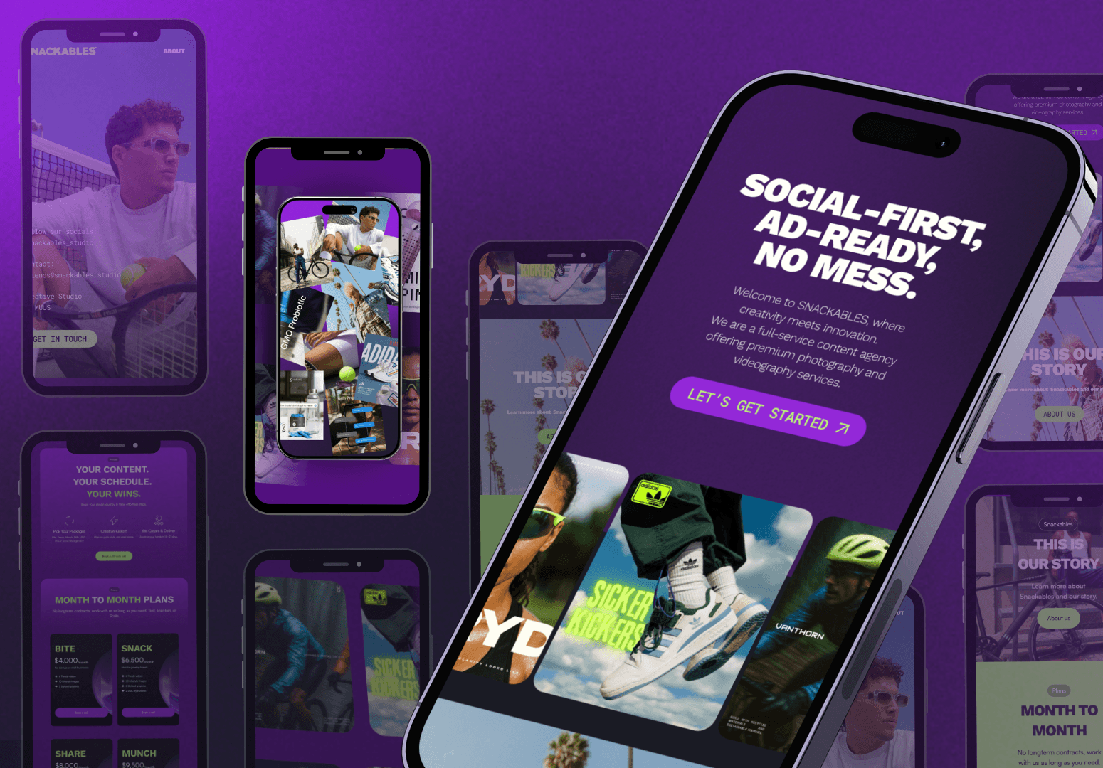
The objective of this branding was to create a bold and recognizable brand identity from the ground up for content agency, Snackables. The strategy focused on capturing attention in a fast-paced digital environment while clearly communicating the agency’s offering of high-quality content at accessible prices.
The direction was centered around a playful and confident visual language. Through bright color palettes, rounded typography, and a distinctive illustrative logo, the brand was designed to stand out and feel approachable while maintaining a strong and memorable presence. The concept draws on the idea of content consumption.
Execution & Outcome
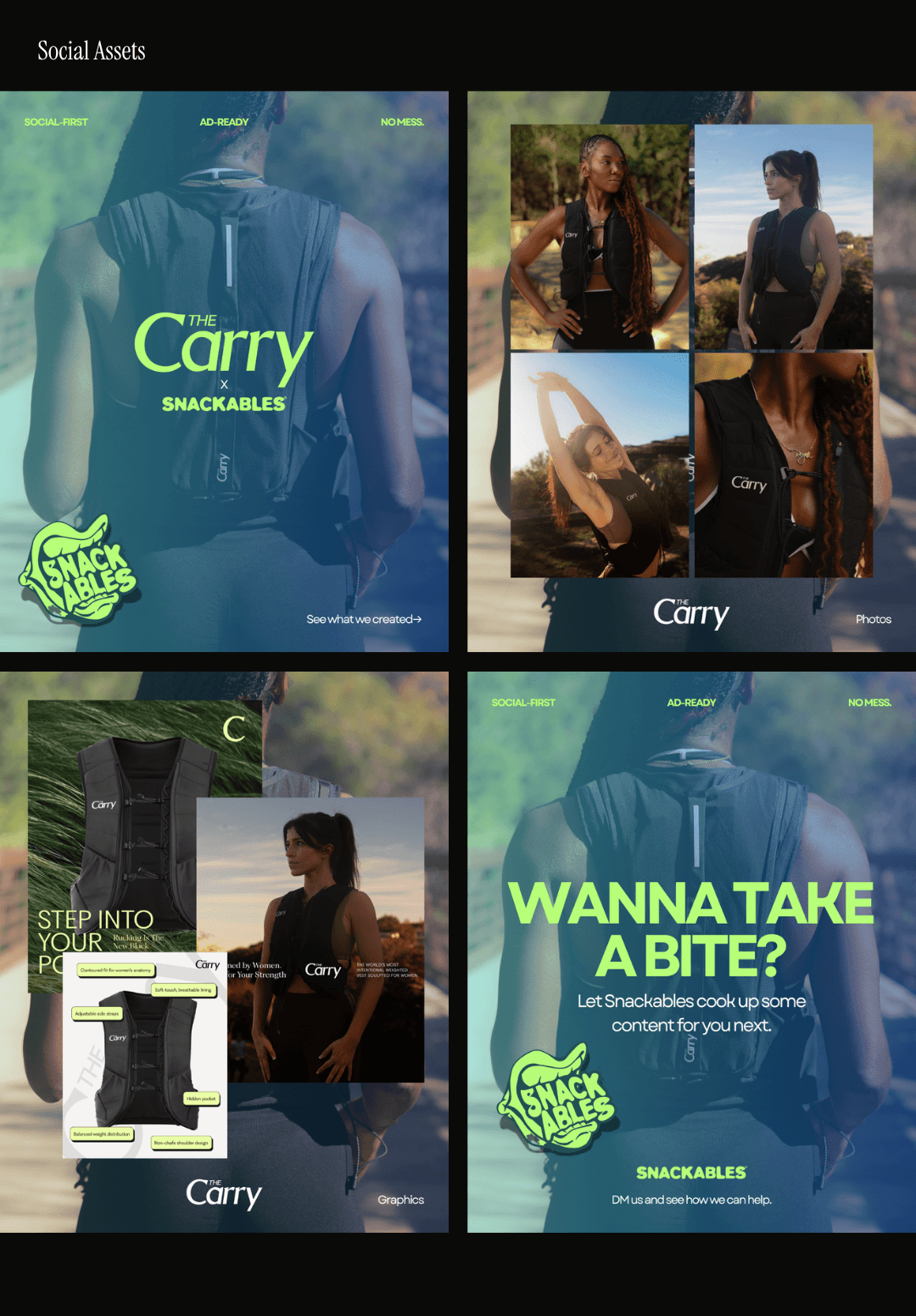
The project was executed independently, covering the full development of the brand identity including logo design, illustration, typography, and a cohesive visual system. This extended across website design, social media assets, and brand and pitch decks, ensuring consistency across all digital touchpoints. Art direction played a key role in shaping the overall tone and visual coherence of the brand.
The outcome is a clear and impactful brand identity that effectively positions Snackables within the content creation space. The visual system supports strong recognition and engagement, contributing to customer acquisition and generating over 300,000 clicks through targeted ad campaigns, demonstrating both creative and strategic impact.